

"Heel tevreden over het eindresultaat en de samenwerking"
A new logo requires a new stand and that was the situation at Hoppenbrouwers.
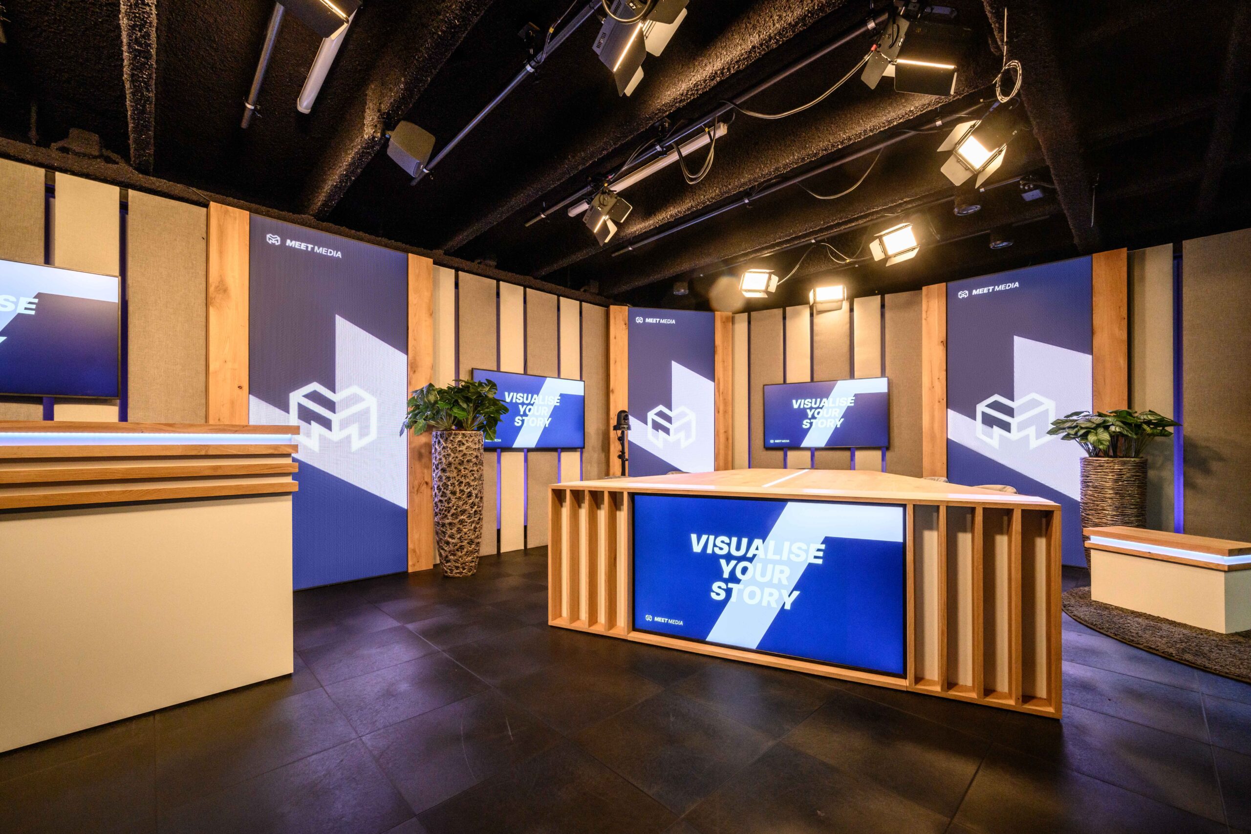
This gave us a little early introduction to Hoppenbrouwers’ new logo. A powerful symbol of growth, innovation, and collaboration.
“Every day, we work on tomorrow’s future. We bring change, and so we change with it. We are more than just technology and believe in a sustainable world. A powerful symbol representing growth, entrepreneurship, and innovation is essential to this. And that’s reflected in our new logo. It refers to the elements that are important to us and our way of working: strict adherence to agreements, flexible solutions, and always close by, for both employees and customers. The word ‘technology’ no longer appears in our new logo. We transcend technology without losing our technical heart.” And that also had to be made visible at the 2024 edition of the Aqua trade fair.
This new logo and corporate identity inspired the desire for an open, sleek, yet not too symmetrical new exhibition stand. Hoppenbrouwers transcends technology without losing its technical heart, and this stand also transcends the standard, sleek, technical stands. It has become a spacious, inviting stand with an open and warm character. The reason for this, in our opinion? The spacious design, the warm materials chosen, and the asymmetric layout. Furthermore, the beautiful full-color images on the walls create a stunning and powerful look, while still showcasing that technical heart!
Curious about us? Read more here about our compelling, comprehensive approach, which we also showcased at this stand.